
The context
In 2023, Advanced Info Service Public Company Limited (AIS) accounted for 46 percent of mobile subscribers in the Thai mobile market, making it the largest telecommunication company in the country, with over 45 million subscribers nationwide.
Facing the rise of direct rivals and the continuous evolution of the market across every spectrum, AIS found itself compelled to transform in order to maintain its top position. Their mobile app appeared outdated and their design system, which the entire digital UI relied on, was in need of an update. It was clear that there were areas requiring attention.
Getting the ball rolling
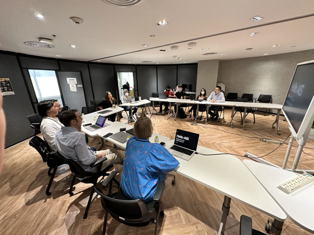
It began at the AIS head office in Bangkok, where we met with stakeholders and the team. Several workshops were held, which formed the strategy and vision for the project.
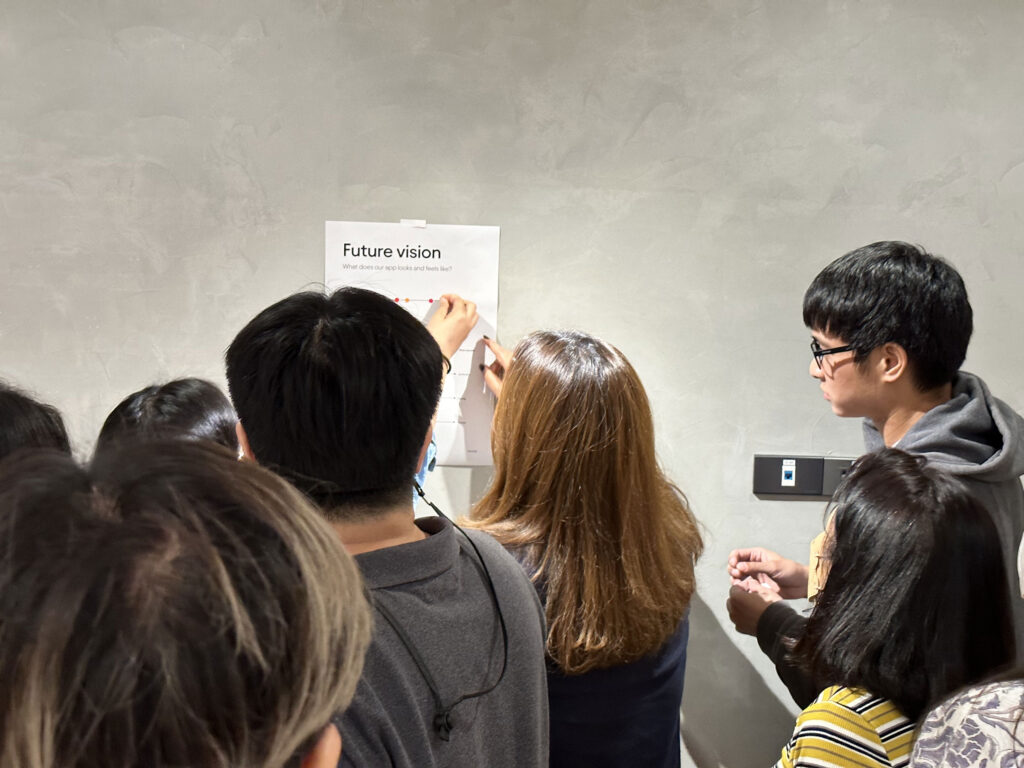
Look and feel
In one of the workshops, we asked participants to place their dots on scales representing characteristics they believed the app would embody. By analyzing the results, we were able to formulate two routes, which then became the vision and direction for our two concepts.
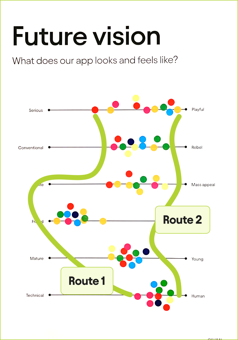
Concept design iteration
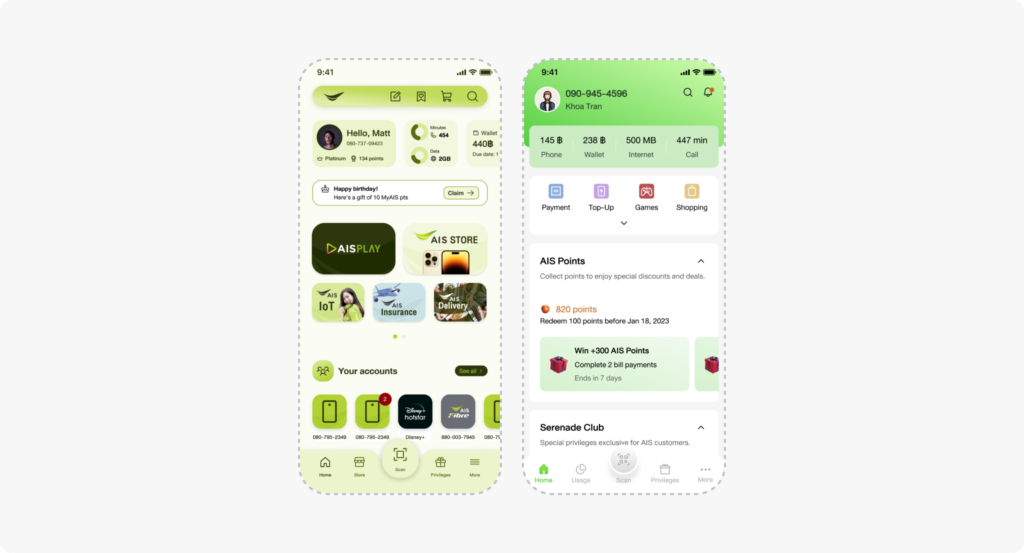
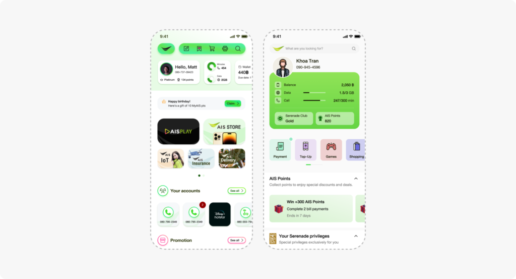
Two concepts were created, each reflecting one of the two routes in mind, based on the team’s hypotheses, with limited insight and knowledge of user expectations at the time.
User testing
Now it was time to put our hypotheses to the test.
We sent out 10,000 survey invitations to AIS customers, covering a wide range of demographics, to evaluate the concepts against the current app. With a response rate of 3%, we gained valuable insights and developed a better understanding of the direction we were heading in.
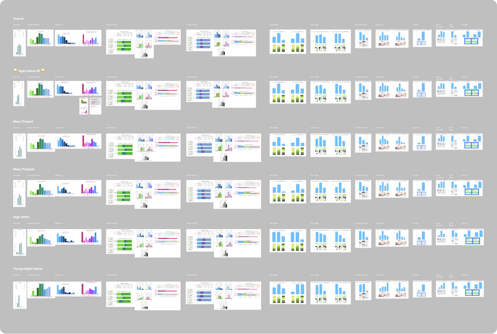
The result played a significant role in our decision-making process and helped us understand various design aspects, ranging from overall information such as user personas and behaviors to more details such as the importance of specific content and preferred color schemes or layout arrangements.
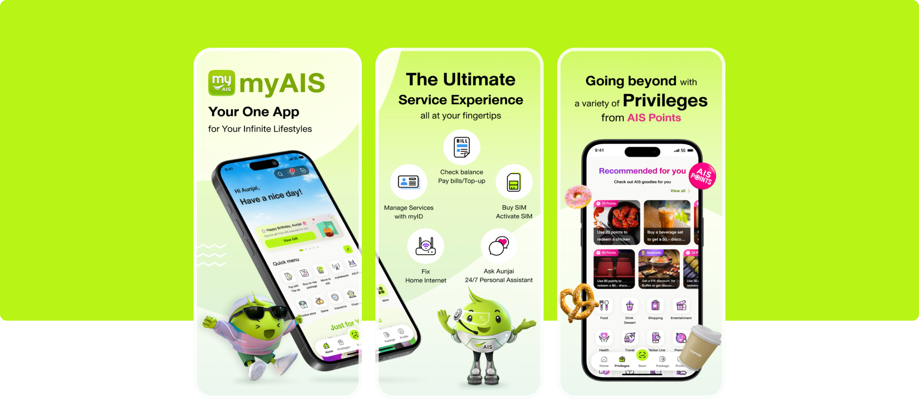
The design system
Our team of nine people, whom we called The Fellowship of the Bling, set out on a journey not to destroy (the one ring if you are wondering), but to rebuild the design system we named Chameleon. This name reflects its colorful appearance and its ability to adapt to the environment it’s in.
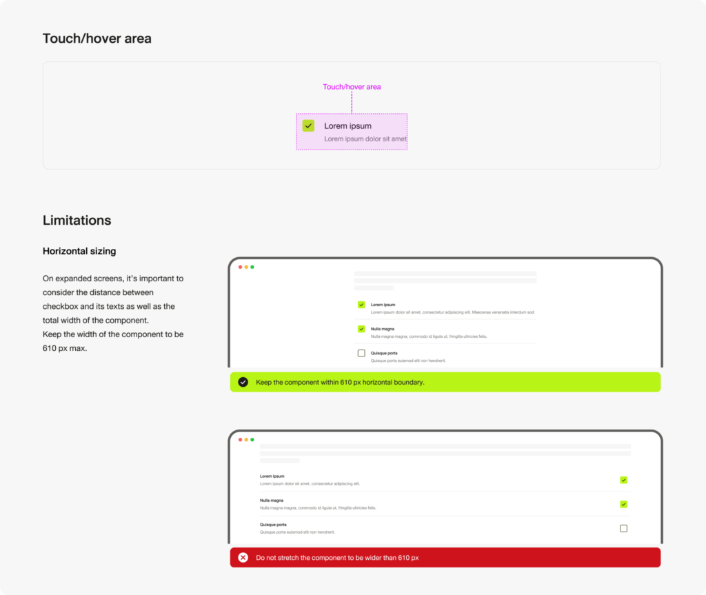
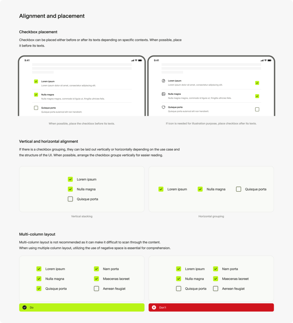
Utilizing the Atomic design methodology, we divided the tasks into Atoms, Molecules, Organisms, as well as Foundation and style. Each component was finely crafted with attention to details such as anatomy, specifications, and usage documentation. Task management was facilitated through the Jira Agile methodology.
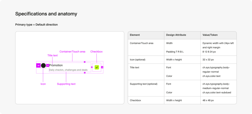

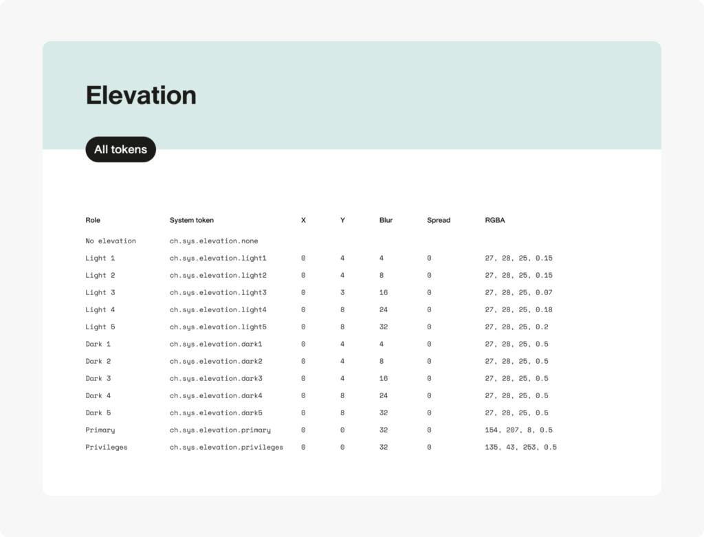
We incorporated a token system into the design system as soon as Figma began supporting it. Colors, typography, spacings, radiuses, and elevations were tokenized and aligned with the development team’s naming convention.
For individuals in development, sales, or any other non-design team, the onboarding process into the design system was carefully planned to facilitate a smooth learning curve.
Last but not least
As soon as some of the first atomic components were built, implementation had already begun. We carefully managed our workload to ensure that the progress of the design system always stayed one step ahead. Some resources were also redirected towards feedback and request management once product designers started utilizing the design system for app design.
That was just the beginning. We, the gatekeepers, continued to maintain and improve the design system, adding more features while keeping it neat and well-organized.
Thanks for scrolling this far, here’s a rare pic of some of our team members “working” hard.